
The Challenge: Sports fans often struggle to find partners who understand their lifestyle. Traditional dating apps ignore the "logistics of fandom," leading to mismatched expectations and arguments over weekend schedules.
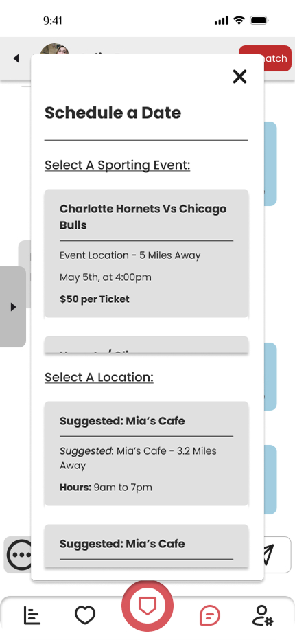
The Solution: Teammate leverages sports APIs to filter matches by fandom intensity and streamlines the "first date" logistics by auto-scheduling dates around live game events.
Role: Co-Product Designer (End-to-End)
Timeline: 3 Weeks (2024)
Tools: Figma and Adobe Photoshop
Platform : iOS Mobile App
.png)

Pros:
Inclusive, user-friendly, women initiate.
Cons:
High competition, conversation fatigue.
Pros:
Global reach, massive user base, simple interface.
Cons:
Reputation for casual dating, shallow connections.
Pros:
Quality over quantity, detailed profiles.
Cons:
Slower matching, limited visibility for new users.
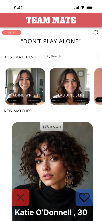
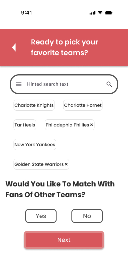
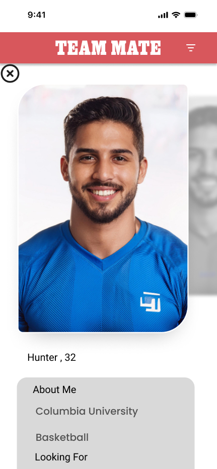
Observation: Users seek partners with a sports background because they associate it with positive qualities like "teamwork and determination."
Design Implication: Profiles prioritize "Sports Background" to signal these character traits early.
Observation: Users are "open to trying new sports," especially if guided by an enthusiastic partner.
Design Implication: The app shouldn't just match experts; it should facilitate "learning" dates between die-hards and newbies.
Observation: Users find current dating apps "lacking in depth and safety."
Design Implication: We focused on organizing dates in "secure public venues such as sports events" to alleviate safety concerns.
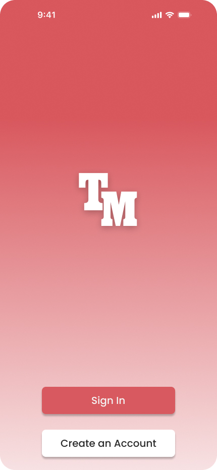
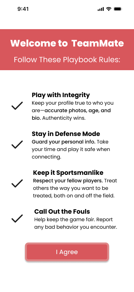
In sports, the logo on your chest represents loyalty, history, and community. For TeamMate, we moved away from the generic 'heart' iconography of dating apps and designed a Varsity Monogram
The block-letter 'TM' mark mimics the aesthetic of a collegiate team crest. This was a strategic choice to make the user feel like they aren't just joining a dating app,they are getting recruited onto a team. It transforms the app icon into a badge of membership.
.png)
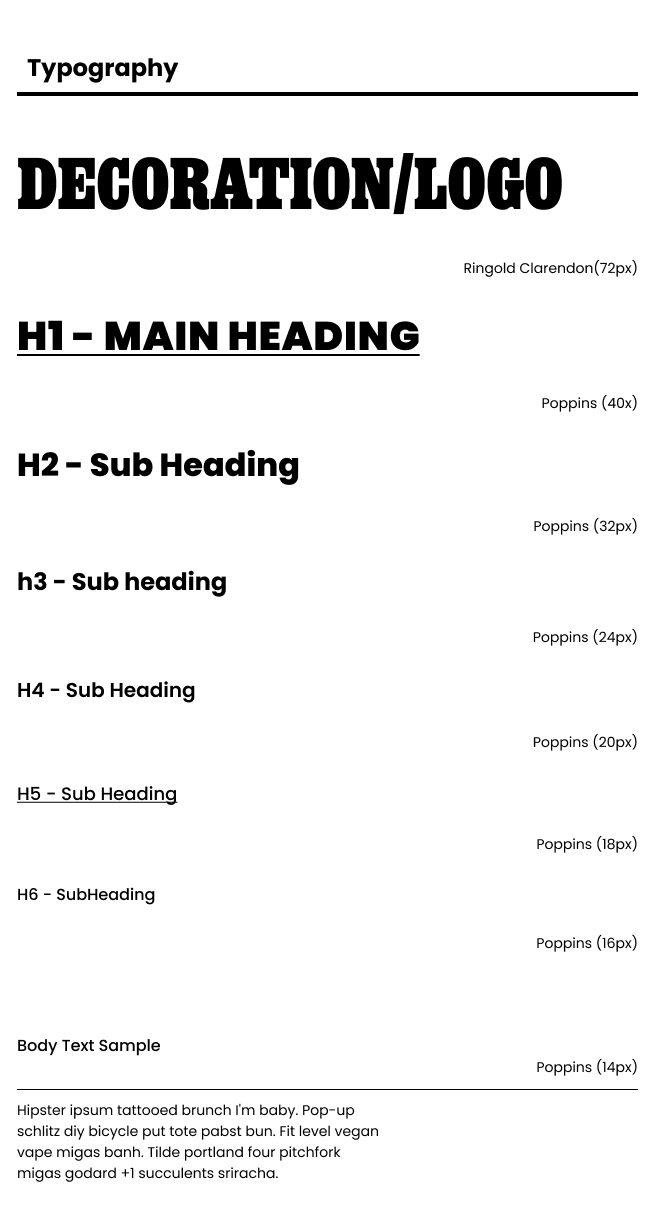
We needed a type system that could scream 'Game Day' without sacrificing legibility on a small mobile screen.
Display Font (Ringgold Clarendon): We chose this heavy slab-serif because it evokes the nostalgia of vintage scoreboards, varsity jackets, and jersey numbers. It sets the 'Stadium' tone immediately.
Body Font (Poppins): To balance the heavy headers, we used Poppins. It is a geometric sans-serif that ensures high readability for chat messages and event details. It provides a clean, modern foundation that allows the 'loud' headers to stand out.
Color is the strongest emotional signal in sports. We avoided the soft pinks of traditional dating apps in favor of a high-contrast palette that bridges the gap between romance and competition.
Passion Red : This color plays a dual role. In sports, it represents adrenaline, aggression, and energy. In dating, it represents passion and the heartbeat of attraction. It drives action on primary buttons.
Highlight Gold : Gold is universally associated with trophies, championships, and victory. We use this for accents and success states to subtly reinforce the idea that finding a match is a 'win'."
.png)
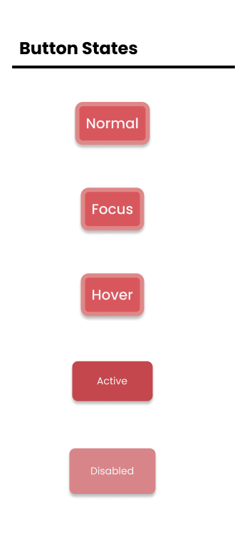
Sports move fast, and so should the UI. We designed a clear system of interaction states to prevent user error during the ticket booking flow.
Active: High contrast Red/Gold to signal 'Go'.
Disabled: Low opacity to prevent premature clicks before forms are filled.
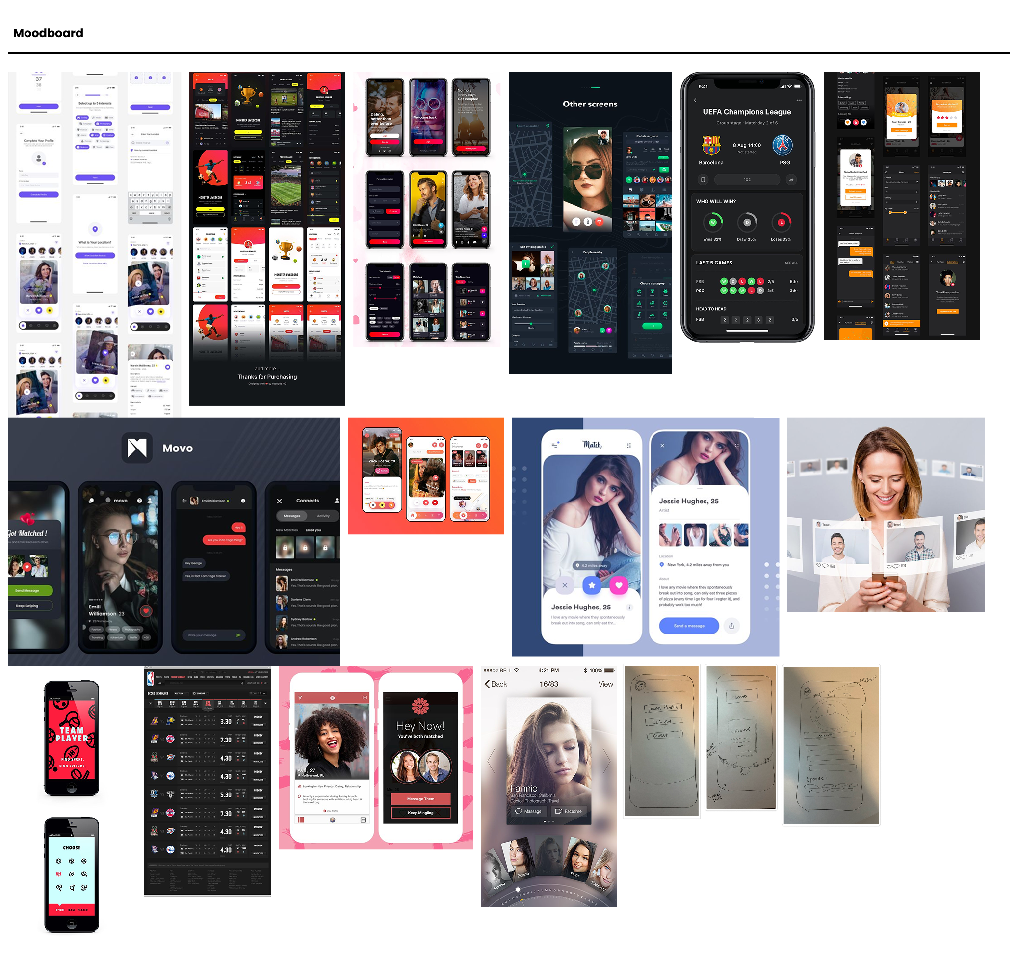
We gathered a wide variety of dating app formats to explore different ways to structure our interface. Our research included a mix of styles, ranging from standard clean layouts to apps with immersive dark backgrounds that offered a distinct 'nightlife' vibe.
This exploration helped us find the right balance. We adopted the familiar, user-friendly formats found in our research but infused them with the high-contrast energy we admired in the darker designs. This resulted in a 'Varsity' aesthetic that feels bold and energetic while remaining clean and easy to read.
.png)
Implementing a live stream option to watch games together virtually
Expanding beyond dating to find platonic friends and local fanbases
Changing the display colors to represent the fanbase the user is currently swiping on